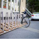
Quebec City’s bike rack
 Design Debacle: Quebec City’s Bike Rack Competition Yields $23,600 Cost Per Rack
BY RAIN NOE From Core77
Design is intended to solve problems. And the original hope of industrial design, as promulgated by ID granddaddy Raymond Loewy, was that it would make mass-produced items beautiful, useful, and more economical to produce.
But too often modern-day design goes astray, pursuing just one of the aforementioned qualities at the expense of the other two. In pursuit of beauty in particular, designers are at risk of drinking their own Kool-Aid, imposing their completely subjective notions of beauty onto a public that may not share their sense of aesthetics.
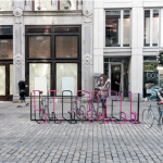
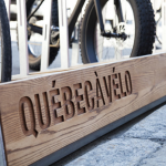
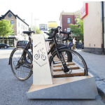
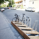
I believe that is exactly what has happened with Quebec City’s recent bicycle rack design competition. The city’s mission was noble enough: Promote bicycle commuting by populating the place with bike racks. But the two designs selected as finalists are not exactly a hit with the very cyclists that would be using them. Here’s one of the designs, Québec à vélo by architecture firm Para-Sol:
“The project proposes a bike rack concept that differs from more standard models in its materiality of wood, both identity for the City of Quebec and evoking an ecological will. The sober design of the object and its modular qualities make it a furniture that integrates well with the urban context and more specifically with a parking space. The new furniture stands out in the environment where it is established thanks to its strong volumetric presence.
“The geometry of the support, composed of a series of oblique pieces of wood, naturally communicates to cyclists the places where to park their bicycles. Visible from the sidewalk, a long beam incorporating a customizable signage helps to spread a message promoting the bike. On it is engraved numerically the name of the district followed by the means of transport which one wishes to promote; BIKE QUEBEC. As a whole, the support incorporates a series of thoughtful practical details to make the cyclists happy.”
This is your typical architecture-speak BS. The sentence “The new furniture stands out in the environment where it is established thanks to its strong volumetric presence” doesn’t actually mean anything. Also, no cyclist is clamoring for a rack design with a “strong volumetric presence.” They want a secure way to lock their bike up. Sure, this rack might do that, but before I get to why this design is a problem, let me show you the second one:
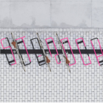
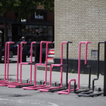
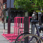
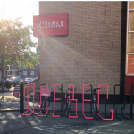
That’s the ABCyclette by Hatem+D Architecture.
“The idea for Abcyclette is that the shape of the bicycle parking rack becomes the name of the ‘station,’ much like other transit systems. For example, users leave the bicycle at the ST-ROCH station. From another viewpoint, people can see an array of colourful tubes that are both pleasing to the eye and very intriguing. The words can nevertheless be seen from the sidewalk on the other side of the street and, thanks to anamorphosis, from other vantage points as well. While this may seem complex, the end result is simple and the impact, immediate.
“Abcyclette bicycle parking racks not only beautifully mark the streets, but they also serve as functional urban art. The racks can be adapted to all sorts of uses, including for citizens and tourist routes. Abcyclette inspires curiosity and discover—and incites people to interact with it to uncover its true meaning.”
More architecture-speak. “…Incites people to interact with it to uncover its true meaning”? Give me a break. How exactly would this play out? I’d argue that no cyclist cares that a bike rack spells out the name of the station. Cyclists want a place to lock their bikes up.
Whether or not you find either of these designs attractive, here’s the real problem, as reported by CBC News: Once you add up the prize money, and the prototyping, copyright and jury fees, then the actual production costs, Quebec City is getting “seven racks, at a cost of $23,600* each.”
“CBC News called several bike rack retailers and found several designs for the same number of bicycles in the range of $600 to $1,000.”
In other words, the city could have made at least 23 times as many bicycle parking spaces available by simply buying off-the-shelf. “It’s kind of a shame, because it’s a lot of money that could have been used to just add more ordinary bike racks,” Caroline Sigouin told CBC News. “We’d have been so happy with that.”
I think any cyclist would rather have a good chance of finding rack space on an ugly rack, than struggle to find a free slot on a designey rack.
*About $18,000 USD.
For more on this story go to: https://www.core77.com/posts/79418/Design-Debacle-Quebec-Citys-Bike-Rack-Competition-Yields-23600-Cost-Per-Rack?utm_source=feedburner&utm_medium=feed&utm_campaign=Feed%3A+core77%2Fblog+%28Core77.com%29

