Boost your conversion rate with the help of UX
Nowadays, in the online world, millions of websites, blogs, or online stores are waiting for potential visitors or buyers. The range of possibilities is huge, which is why the decision is difficult: “Should I buy the product from here or on another webshop?”
Your online store will only be successful if a potential customer clearly votes for you when they have to make a decision. This is the basis for you to increase your conversion rate.
However, to achieve this, you need to be different from your competitors. The solution to this is to provide the perfect user experience.
The secret of great UX
When someone hears the word that user-experience then usually some kind of image, colors, or good content might come up with. This is partly true, as these also contribute to making your site aesthetically pleasing and transparent, but UX covers more than that. It has a direct impact on your branding in general.To make your website really user-friendly, you need to pay attention to:
– The logical layout of the subpages
– The loading time
– The placement of your products
– The information about products
– And cart optimization

These factors make it easier to navigate your visitors to your website, they facilitate shopping and reduce bounce rates. These factors will definitely help you to boost your conversions.
When arranging your subpages, make sure they fit together logically and with their content. No one wants to read about your services when searching for a blog interface. Allow movement between each subpage, especially on your landing page.
If you have more than one product, separate them into different categories. In this way, you can avoid your potential customers spending more time searching for the product than necessary. If they have to search for that product too long, there is a great chance that they will leave your website which will not have a good effect on your conversion rate.
The biggest enemy of the conversion rate is a poorly crafted cart. This is because it is the last step that separates your potential buyer from the product.
What do you have to do?
The most important things you have to take care of when your goal is to create a great user experience are:
– Landing Page
– Product placement
– Cart optimization
If these three factors are not right then failure is almost certain. Let’s see why.
Landing page
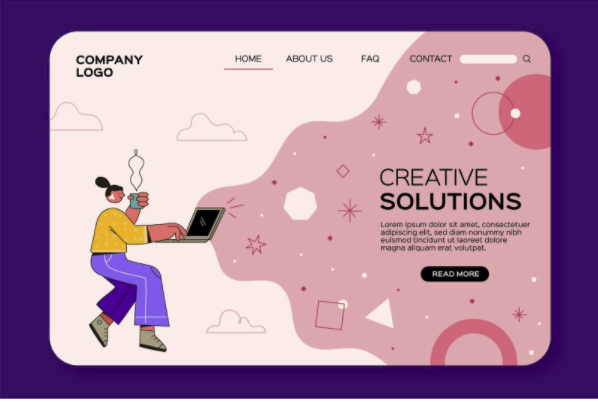
A landing page is a page that your visitors first encounter when they visit your website in some way. On this site, it is worth playing with design, with your key colors, logo, and standard design elements recognizing your website.
It’s important to say a few words about yourself, what your goal is, what you represent. This is very important because you are developing a kind of relationship with your visitor that will increase the confidence. Trust helps them get a better chance of buying from you, which will increase your conversion rate.
Another factor of a landing page is that your visitors have to find all the features on it. You do not know that they came because of your product or they may want to read your blog. Make it easy to find everything.

Product placement
Let’s say your potential buyer is already on your product site. As we mentioned, you need to separate each product in advance for easier transparency, but what do you need to do on the product site itself?
At this point, you should strive to convince your visitor that this is the product he really needs. Write information about the product, show its benefits, or show what previous customers think about the product.
Also, use the classic elements of your website here, if you have a mascot figure then this is the perfect place to display it. All of these UX elements and techniques will help to finally get the product in the cart and ultimately increase your conversion rate.
Cart optimization
Now or never. It may be an exaggeration to say that never, but in any case, if your potential buyer has a problem between the cart and the payment, or maybe something shakes their confidence then you can be sure that that product won’t be purchased.
There are a few things you need to consider to avoid this. First and foremost, allow them to choose from several payment options.
Many people still fear that they will have to provide their bank details, allowing them to take over the product in person. Allow paying with all major types of credit cards, such as VISA or Mastercard. That way, there can be nothing stopping them from buying the product and increasing your conversion rate.
Also, try to equip your cart with the UX elements you used on the landing page, so the trust you build there is more likely to stay in the cart.
Conclusion
As you can see, there is more correlation between conversion rate and UX than you might think. You may have to keep track of the factors listed above in order to get the most out of your website’s performance. The use of heatmaps can be a perfect tool for this.
Use this article as a guide. We hope you find it useful.


