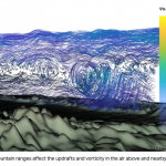
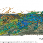
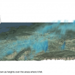
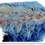
Clouds are complicated, and these fabulous 3D renderings of real weather data prove it
 By Devin Coldewey From TechCrunch
Some people, when they look up at the sky and see a cloud, think “dog” or “fluffy.” And some people think “it’s a waning cumulus with a feathered edge suggesting a pressure system from the north ending in an updraft, which would probably cause turbulence. Also looks a bit like a dog.” Clearly one of those people created these complex, beautiful renderings of weather data.
The idea behind this project at ETH Zürich, led by Markus Gross, is that different visualizations of detailed weather data may be highly useful in different fields. He and his colleagues have been working on a huge set of such data and finding ways of accurately representing it with an eye to empowering meteorologists from the TV station to the research lab.
“The scientific value of our visualisation lies in the fact that we make something visible that was impossible to see with the existing tools,” explained undergraduate researcher Noël Rimensberger in an ETHZ news release. Representing weather “in a relatively simple, comprehensible way” is its own reward, really.
The data in question are all from the evening of April 26, 2013, the date chosen for a large-scale meteorology project in which multiple institutions collaborated. The team created different ways to visualize different bodies of data.
For instance, if you were looking down on a whole county, what’s the use of seeing every little ripple of a cloud system? What you need is larger trends and ways of picking out important data points, such as areas likely to develop precipitation, or where the beginnings of movement suggest a cold front moving in.
On the other hand, such macro data has no place when you’re looking at the formation of clouds over a single locality, or why a storm seems to have struck with unnatural fierceness there.
And again, what if you’re a small aircraft pilot? A little rain and clouds you might not mind, but what if you want to see patterns of turbulence in the country and how they move as the day wears on? Or if you’re investigating what led to a crash at a particular location and time?
These visualizations show how a large set of data can be interpreted and displayed in many ways and to many purposes.
Tobias Günther, Rimensberger’s supervisor on the project, pointed out that the algorithms they used to interpret the reams of data and create these simulations are far too slow at present, but they’re working on improving them. Still, some could be used if time isn’t of the essence.
You can find a link to download the full paper, created for an ETH Zürich visualization contest, at the university’s website: https://www.research-collection.ethz.ch/handle/20.500.11850/237747
For more on this story go to: https://techcrunch.com/2018/04/23/clouds-are-complicated-and-these-fabulous-3d-renderings-of-real-weather-data-prove-it/?utm_source=feedburner&utm_medium=feed&utm_campaign=Feed%3A+Techcrunch+%28TechCrunch%29


