Logos & colours
 How these 23 brands are using colors in their logos to influence their customers
By Julien Rath From Business Insider
Lufthansa
Olt Aicher, the designer behind the Lufthansa logo, never considered the branding to be fully finished.Michael Dalder/Getty Images
Supposedly 80% of the information we receive from a logo comes from the colors contained within it. That’s because different colors evoke different feelings and emotions.
Companies will often go to great lengths to make sure their logo perfectly matches their branding strategy. Google famously tested 40 different shades of blue in its logo to see which one performed the best.
Some industries favor particular colors, like tech companies that predominantly use the color blue, or fast-food restaurants which prefer to use red.
The information in this article was sourced from Towergate Insurance’s “Colour in Branding” infographic, plus our own research.
McDonald’s
Justin Sullivan/Getty Images
McDonald’s uses red because it’s seen as an energizing and stands out easily. It’s even thought the color stimulates hunger, which may be why a number of other fast food brands use the color.
Red is also often used to signal a sale, so many brands will use it in combination with a softer color like white or yellow to convey the properties of red without risking the perception the brand may be going out of business.
Subway
Joe Raedle/Getty Images
With the use of green, which is often used to signal health and restoration, Subway looks to convey the values of freshness which it has put at the core of its brand.
Yellow is also another color that can easily be spotted from far away and draw consumers to its restaurants.
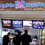
Baskin Robbins
Flickr/bargainmoose
Blue and pink are often combined to promote sugary products since pink signals sweetness and playfulness.
Carol Austin, VP of marketing for the brand told CNBC the logo is “meant to convey the fun and energy of the Baskin-Robbins brand.”
The logo also has a hidden message: The pink 31 in the logo stands for each day in the month that consumers can discover a new flavor.
United Airlines
REUTERS/Louis Nastro
Blue is used to signal trustworthiness, often demanded by consumers from airlines.
It’s also associated with reliability and loyalty, which is why law enforcement uniforms are blue.
British Airways
AP
British Airways keeps the values of trustworthiness and reliability brands can get from using blue, but adds in red, signaling warmth and comfort.
The current logo was originally designed in 1997 and hasn’t changed since.
Lufthansa
Thomson Reuters
Like many other airlines, Lufthansa uses blue but it’s one of the few to add yellow, which stands for happiness and optimism.
The visual identity was introduced by the German graphic designer Olt Aicher and was considered one of the most successful rebrands of the 20th century. But Aicher himself never considered the design as mature, according to Disegno.
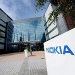
Nokia
Thomson Reuters
The color blue is often used by telecoms companies because it conveys clarity and security.
The current Nokia logo has been in place ever since it moved to telecommunications equipment — before that it was a paper mill company.
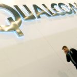
Qualcomm
Thomson Reuters
Qualcomm is a pioneer of many technologies found in smartphones today.
The chips it produces are used by the majority of smartphone brands, including Apple, Samsung, and LG among many others. The black in the logo signals strength and security, both essential to any smartphone manufacturer.
Chanel
AP Photo/Eugene Hoshiko
Chanel was the pioneer of the famous “little black dress” so it’s only natural for the color black to be a core part of the brand’s identity.
Black is considered to be a very fashionable color and stands for the sophistication in the retail world.
Vans
The use of black to signal elegance and red for passion falls in line with Vans’ values of enabling people to do what they love.
The brand has recently started to look to appeal to audiences outside of skateboarding and its latest campaign is all about people following their creative passions.
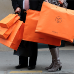
Hermes
Philippe Wojazer/Reuters
Orange is thought to exude extroversion and confidence, which Hermes has every right to as the world’s second most valuable luxury brand.
The brand reportedly chose the color orange out of necessity: It was the color of the only paperboard available to the company during the Second World War.
Toyota
Matt Cardy/Getty Images
The different shades of silver often used in the automobile industry stand for quality and workmanship.
The Toyota logo took three years to design and is meant to be recognized head-on and in a rear view mirror. The two inner circles represent the relationship between the customer and the brand living together in the world, which is depicted by the bigger circle around them.
Audi
AP Photo/Matthias Schrader
The red Audi script in the logo is meant to stand for masculinity of the brand and a love for driving.
While much can be read into the four rings logo, the reasoning behind it is practical: Audi was one of four car companies that merged in 1932. The logo of the new company became all four logos in circles linked together. The individual brands’ logos were eventually dropped, leaving only the four rings.
Volkswagen
AP Photo/Michael Sohn
With the blue in its logo, Volkswagen wants to convey the values that German cars have become known for: Reliability and consistency.
It also fits with the name of the brand, which translates to “car for the people.”
The Range
The British improvement store chain decided to go with blue in its logo to help customers relax before taking on a big DIY project.
The Home Depot
Flickr / Mike Mozart
Orange is considered a youthful color, which evokes a feeling of excitement and fun.
The brightness of the color makes it easy to spot a Home Depot from far away.
Screwfix
Ian West/PA Archive/PA Images
Screwfix is the biggest British store in the country catering to professional handymen.
It uses red, which is thought to raise the heart rate and physically motivate people, in Screwfix’s case, to get to work on construction projects.
Pfizer
AP Photo/Mark Lennihan
Medical companies will often turn to blue because it stands for cleanliness and health.
The oval shape of Pfizer’s logo, which was created in 1987, is meant to be similar to that of a medical pill.
GlaxoSmithKline
Thomson Reuters
GSK is a recently created company, formed out of a merger of two British pharmaceutical companies.
This edition of the logo was created in 2014, but the color orange has always been a part of the company’s branding. The color is often associated with feelings of happiness and confidence.
Merck
Kris Tripplaar/SIPA USA/PA Images
The American pharma company, one of the largest in the world, has gone through multiple editions of its branding. The green logo is associated with feelings of health and healing.
USPS
Kevork Djansezian/USPS
Blue is considered a color that promotes feelings of trustworthiness and security.
The eagle in the USPS logo was always a part of the brand, but it’s only since 1993 that the current “sonic eagle” has been on mail delivery trucks.
Royal Mail
Joe Giddens/PA Images
When it comes to brand recognition through color it’s hard to pass on the UK’s postal service, Royal Mail.
It has strict guidelines when it comes to branding: Each iconic mailbox has to be painted in the standard red and black. The color is associated with dedication and persistence. The mailboxes were originally green, and changed to red in 1874 to make them more visible.
TNT Delivery
Ben A. Pruchnie/Getty Images
The Dutch parcel delivery company is one of the biggest in the world, with a presence in 61 countries and over $7 billion in sales in 2015.
The firm was acquired by FedEx in 2016. It used the color orange to signal its affordability to customers.
For more on this story go to: http://www.businessinsider.com/these-23-brands-are-using-colors-in-their-logos-to-influence-customers-2017-3?utm_source=feedburner&%3Butm_medium=referral&utm_medium=feed&utm_campaign=Feed%3A+businessinsider+%28Business+Insider%29/#tnt-delivery-23


