Stores tricks 1
 Stores use plenty of tricks to get you to spend more money. Here are some of the most common – 1
By Jessica Tyler From Business Insider
Stores of all kinds use tricks to encourage shoppers to spend more money.
Some of these tricks include using calming music and placing pricey items at eye level.
You can become a better shopper by knowing these tricks and avoiding spending more than you plan to.
Supermarkets, restaurants, department stores and boutiques all use similar techniques to get customers to spend more.
Stores are all very carefully designed. Every aspect, from the music playing to where items are placed, is specifically chosen to prompt customers to spend more money.
To become a more savvy shopper and save some money next time you head to the mall, pay attention to these tricks that stores use to get you to spend more money:
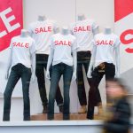
They put a big, bold “sale” sign in the window.
Shutterstock
Stores use big, bold “sale” signs to bait shoppers and draw them into the store, even if they weren’t planning on going in.
They tell you it’s a “limited-time offer.”
Matt Cardy/Getty Images
By stating an offer is limited or won’t last long, it prompts shoppers to act right away, causing them to buy things they weren’t necessarily planning on.
Source: US News
They greet you with big shopping carts.
Getty Images
It’s easier to overspend when you can put everything in a big shopping cart instead of having to carry it all.
They put colorful produce at the front of the store.
Flickr/Garry Knight
The bright colors of fresh produce tend to put people in a good mood, so they think more highly of the store and end up spending more.
They put baked goods and flowers at the front of the store.
Jessica Tyler/Business Insider
Having baked goods and flowers at the front of the store has the same effect that the produce does. All of the bright colors and good smells make shoppers happy, so they spend more because they’re in a good mood.
Calm music is strategically chosen.
Thomson Reuters
Playing calming music makes people slow down, even if they don’t realize it. They spend longer in the stores, and inevitably end up buying more.
Stores go for calm colors, too.
mubus7/Shutterstock.com
Warm, calming colors invite people into stores and make them feel welcomed, putting them in a better mood and making them more willing to shop.
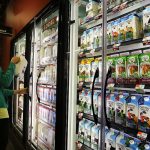
Dairy products and essentials are hidden at the back of the store.
Spencer Platt/Getty
Milk and dairy products are very popular, so stores place them all the way in the back, forcing customers to make their way though the rest of the store and fill their carts with items they may have avoided otherwise.
.
Store layouts change as often as once a month.
Getty Images
Again, by rearranging the store, companies force customers to wander through the store longer to find what they need, leading to customers buying more than they needed.
Stores are designed to move customers from right to left.
Joe Raedle/Getty Images
Because most people are right-handed, and Americans drive on the right side of the road, most people move through a store from right to left. Stores design displays in accordance with this.
For more on this story go to: http://www.businessinsider.com/save-money-by-knowing-these-tricks-stores-use-2018-3?utm_source=feedburner&%3Butm_medium=referral&utm_medium=feed&utm_campaign=Feed%3A%20businessinsider%20(Business%20Insider)


