This Journey Is Turning Heads: Find Out Why

Tuesday has rolled around, bringing with it our in-depth look at a niche website that’s making a big impact.
Today, we’re exploring the captivating world of Must Do Canada, a treasure trove for anyone bitten by the travel bug, especially when it comes to exploring the Great White North.

As we unpack the secrets of this travel gem, we’ll discover not just the beauty of Canada but also the innovative strategies that make Must Do Canada a standout in the travel space.
Site Overview & Highlights
Must Do Canada, meticulously curated by travel enthusiasts Matt and Karla, is not just a travel blog;
It’s a comprehensive exploration guide that emerged from their epic 150-day coast-to-coast Canadian road trip
This website is a labor of love and expertise, offering a plethora of travel guides, videos, and social media content that make Canadian travel accessible and exciting.

With a monthly influx of 62.4k visitors, it’s clear that this site has struck a chord with travel aficionados.
But it’s not just about numbers.
The site’s real charm lies in its personal touch and the depth of content, ranging from hidden gems to popular attractions across Canada.
Diving deeper into the site, one can’t help but admire the rich variety and quality of content that Matt and Karla have put together.
Their travel guides are not just lists of places to visit; they are narratives that weave together the cultural, historical, and natural beauty of Canada.
For instance, their guide on Banff National Park doesn’t just tell you about the must-visit spots;
It takes you on a journey through the park’s majestic landscapes, offering tips on how to experience
ts serene beauty, whether it’s through hiking trails or scenic drives.
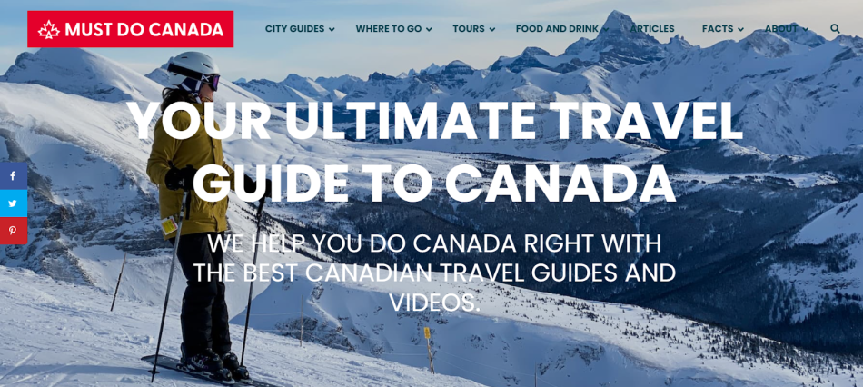
The design of Must Do Canada complements its content beautifully.
It’s clean, intuitive, and visually appealing, making navigation a breeze for any visitor.
The use of vibrant photographs and engaging video content further enhances the user experience.

These elements are not just decorative; they are integral to the storytelling, helping to bring each destination to life.
For example, their video on the Northern Lights in Alberta is not just informative but also a visual treat, capturing the awe-inspiring natural phenomenon in all its glory.
Must Do Canada’s social media presence, particularly on YouTube, is a significant pillar of its success.
With 95k subscribers, their YouTube channel is a treasure trove of travel videos that offer a glimpse into the diverse experiences Canada has to offer.

From city tours to wilderness adventures, these videos are not just guides but also sources of inspiration for travel enthusiasts.
Their newsletter, with 70k subscribers, is equally impressive.
It serves as a direct line to their audience, offering updates, travel tips, and personal insights, further strengthening their community of travel lovers.
The website’s monetization strategy is seamlessly integrated into its content.
Affiliate links are smartly placed within articles, recommending travel gear and accommodations, which adds value to the reader’s experience without being intrusive.
Their partnerships with tourism boards and travel brands are also a testament to their credibility and influence in the travel blogging sphere.

These collaborations result in comprehensive guides that offer a blend of personal insights and professional recommendations.
The clever use of CTAs, especially the newsletter pop-up, is a strategic move by Must Do Canada.
It’s not just about growing their subscriber base; it’s about building a community.
This approach is evident in the way the pop-up is designed –
It’s inviting and promises exclusive content, making it an attractive proposition for anyone passionate about travel.
For more on this story go to: The Niche Letters ben@webassetbuilders.co


